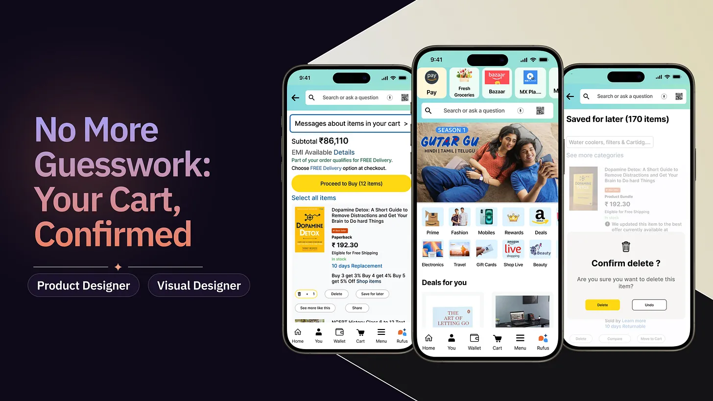
Strengthening Cart Clarity and User Trust: Introducing a Confirmation Popup for Saved Items
Shop With Confidence: Confirming Your Saved Items
Problem Statement
In Amazon’s cart, items moved to “Save for Later” appear visually similar to active cart items, often causing user confusion and accidental deletions. This lack of clarity disrupts the shopping experience, reduces trust, and may lead to cart abandonment or lost sales opportunities.
Business Impact
Every accidental deletion a potential lost sale and a drop in cart retention, which is critical for Amazon’s revenue.
As part of a Product Designer, I explored Amazon’s cart experience to address a recurring usability issue around the Save-for-Later feature. This project became an opportunity to demonstrate my ability to simplify complex interactions while enhancing user trust in one of the world’s largest e-commerce platforms.
The reason, I chose to work on this problem statement is
This domain was completely new to me, and the problem statement seemed like a great opportunity to showcase my UX and UI skills.
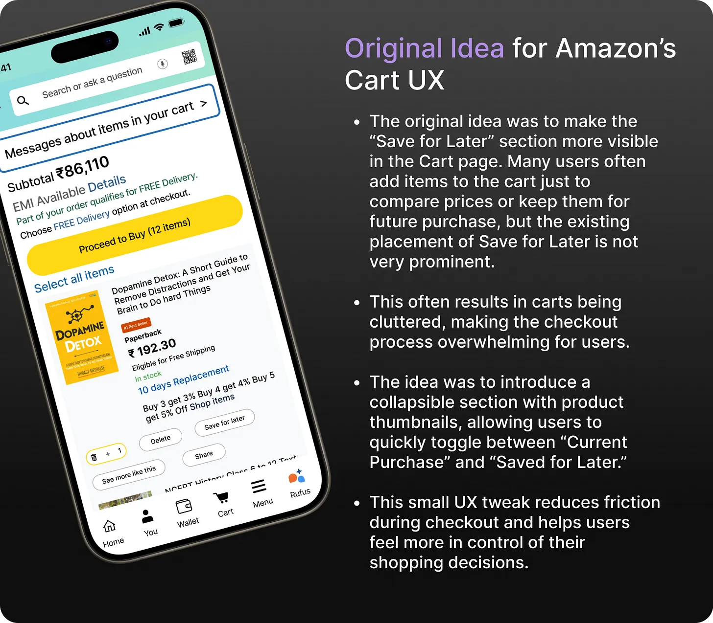
This main idea was to improve Amazon’s cart experience by addressing usability issues with the “Save for Later” feature.
Unlike typical cart interactions, this solution focused on reducing accidental deletions and confusion, ensuring a clearer, more trustworthy shopping experience.
Take a look at the Final Solution, I have came up with
Solution
In response to the problem statement, I proposed the implementation of a confirmation popup within Amazon’s “Save for Later” feature. Currently, there is no such safeguard to prevent users from accidentally deleting or mismanaging their saved items.
This confirmation popup would act as an extra layer of clarity, allowing users to confidently manage their cart without the risk of accidental deletions. By clearly differentiating cart items from saved ones, the feature ensures a smoother and more trustworthy shopping flow.
The solution is designed with multiple heuristics in mind to achieve the following objectives:
Reduce user errors and accidental deletions
Strengthen user trust in the platforms
Improve overall cart usability and retention
This approach amplifies the overall impact. Let’s explore how these improvements were implemented through my solution. To make the experience more engaging and easy to follow, I have incorporated visuals, mockups, and interaction flows for clarity.

Key Strategic Decisions That Transformed the Course of Action and
Streamlined My Approach
Some critical decisions regarding user flows, placement of features, and accessibility challenged me to weigh different factors and consider the impact on both the overall shopping experience and the existing Amazon cart layout.
Let’s see how these choices shaped the solution for the better.
Once I decided to build a confirmation popup to prevent accidental deletions in the “Save for Later” section, the next question was where and how should it appear?
One of the most important decisions I made early on was to integrate the popup directly into the cart interaction flow, ensuring it appears only when users attempt an action that could result in item loss.
Designing for clarity without friction
The primary goal of the cart page is to allow users to view items, check prices, and proceed to checkout. I wanted to ensure that introducing a popup did not disrupt this flow. Hence, it was crucial to design the confirmation step in a lightweight, non-intrusive manner that supports the main purpose of the cart.
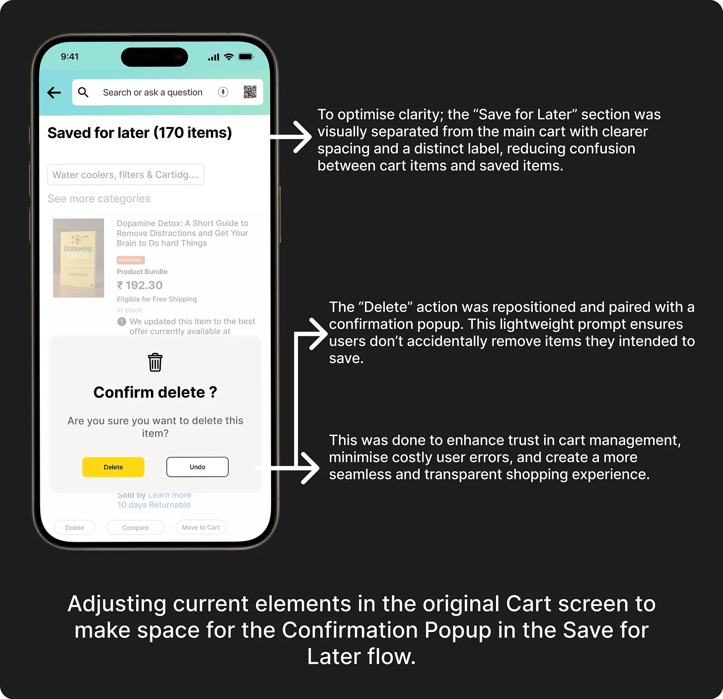
Adding the Confirmation Popup
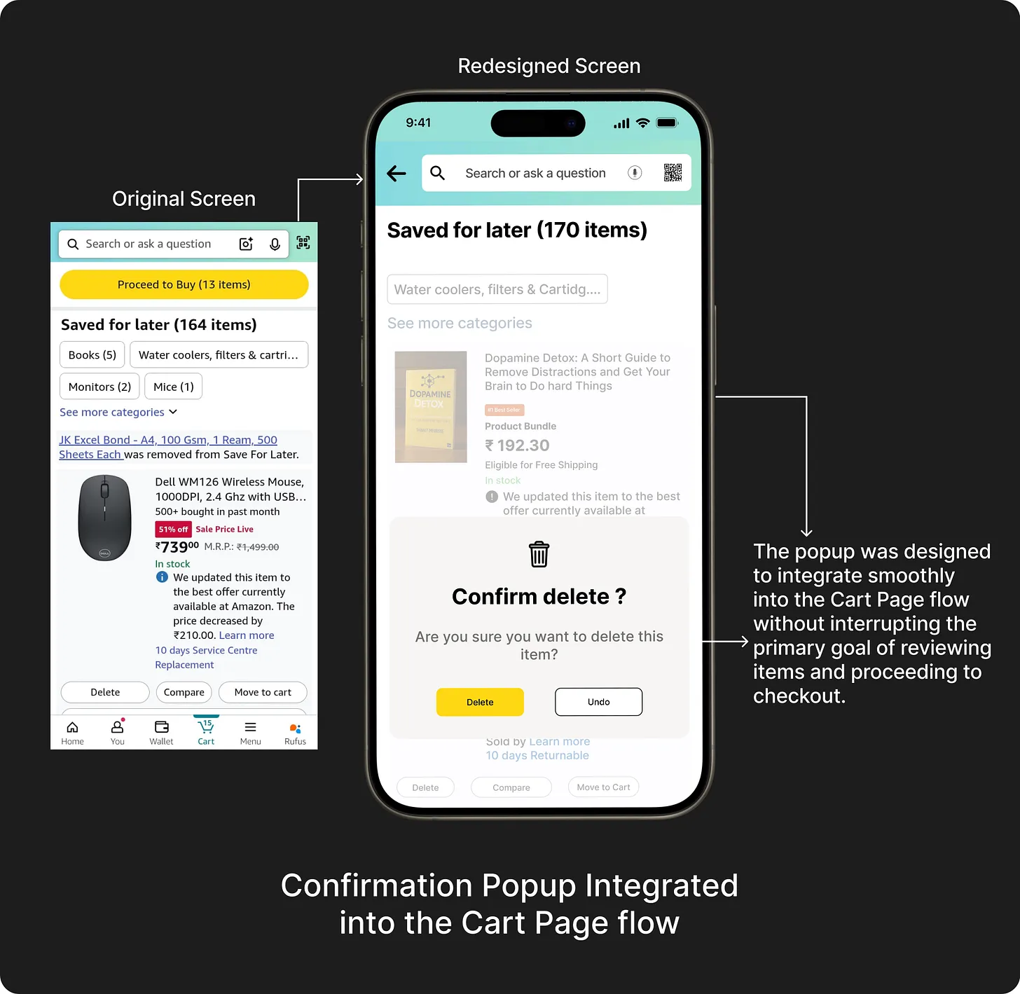

But before taking the above decision, I did a lot of secondary research. I will take you through it all in brief now so that you can understand why I decided certain things.
When I delved deep into Competitive research
First things first. I started to look at how other e-commerce platforms manage their cart experience and prevent user errors. I shortlisted some direct competitors like Flipkart, Walmart, and eBay, as well as indirect players like Nykaa, Meesho, and Shopify stores to study how they handle “Save for Later” features, deletion confirmations, and error-prevention patterns.
Here’s a glimpse of my research and the analysis:
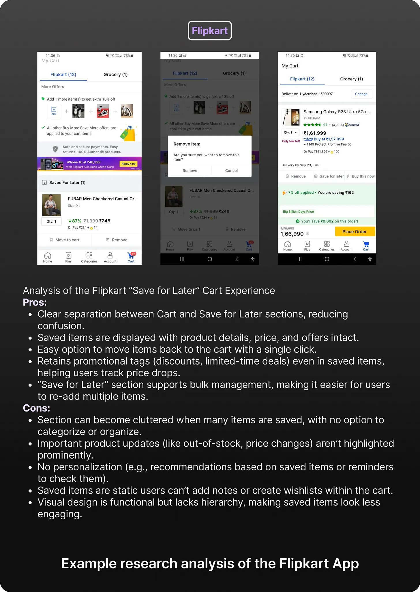
So, why did I choose the cart page to place the confirmation popup?
Out of all pages in the Amazon app, I choose the Cart Page as the ideal point to introduce the Confirmation Popup.
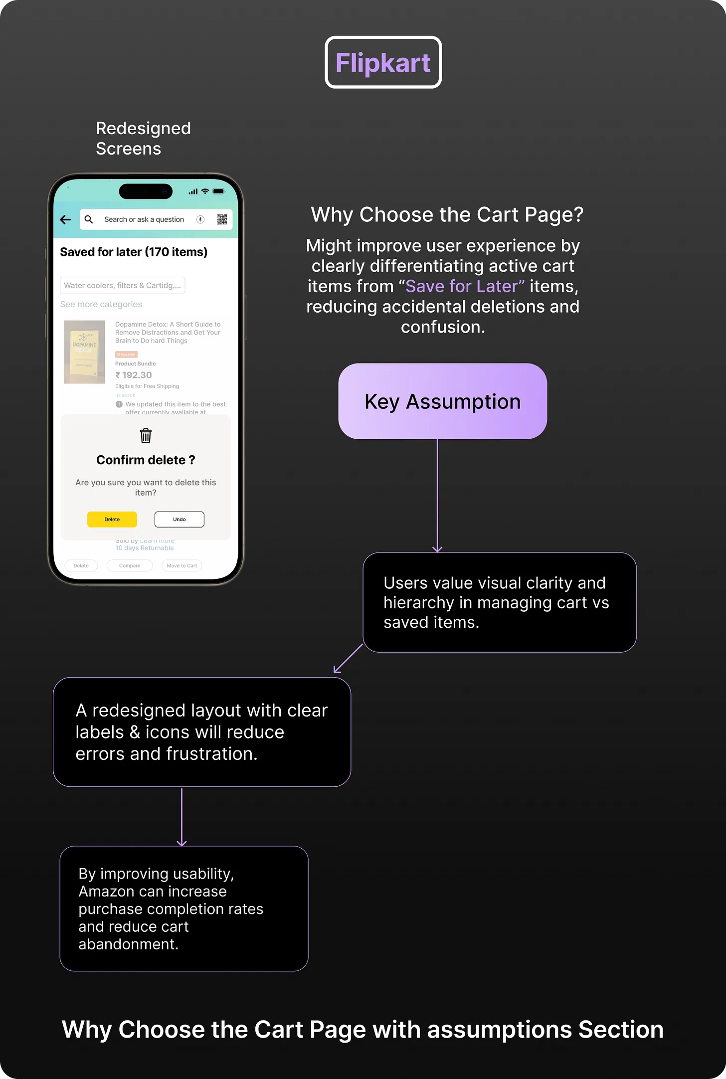
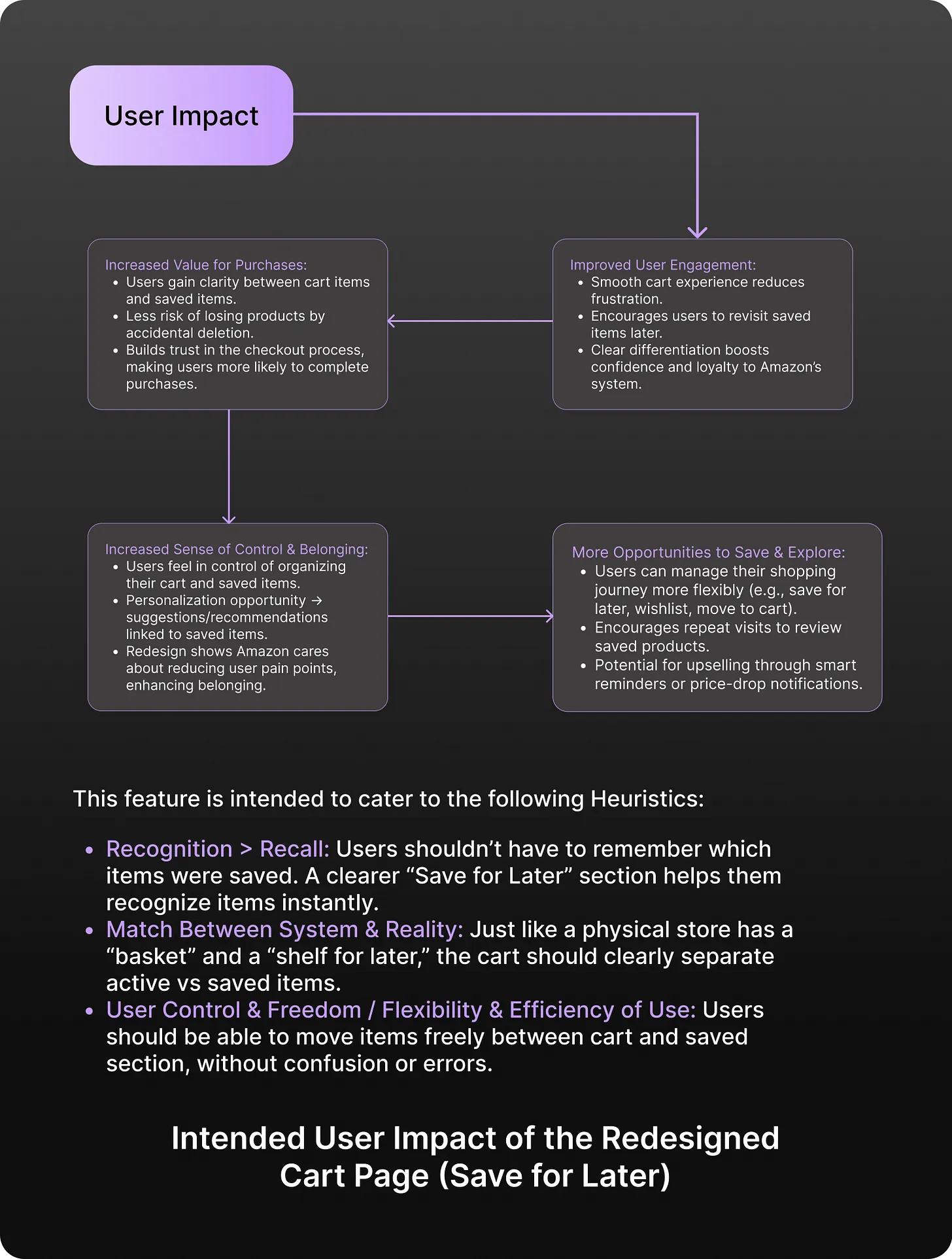
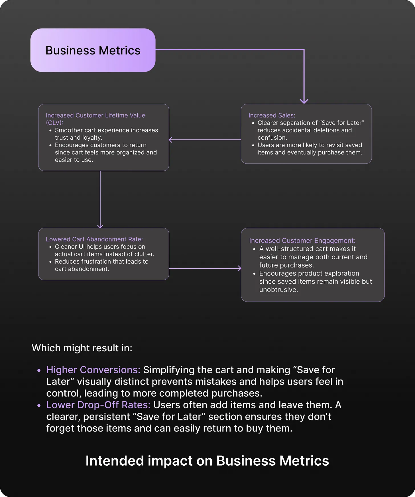
After making the above assumptions, assessing the user impact and the business metrics that might be affected, and reviewing how other e commerce apps handle cart interactions and error prevention, I decided to place the Confirmation Popup directly within the Cart Page flow.
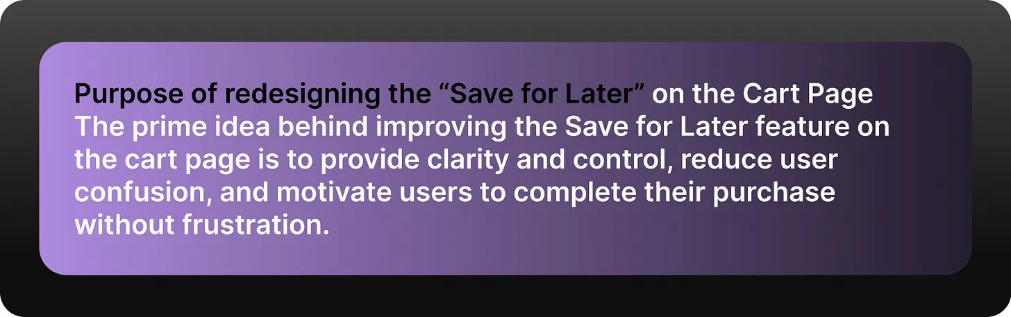
This brought me to my next critical decision.
Optimizing the Confirmation Popup:
My main concern was to make the popup clear and effective without disrupting the primary purpose of the Cart Page allowing users to view their items, check totals, and apply coupons. Hence, I designed the popup to be lightweight, contextual, and non-intrusive.
So, I started small:
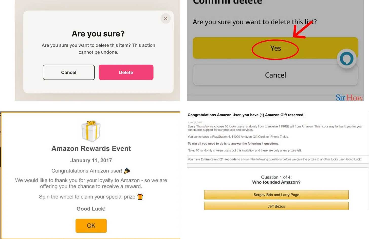
Since I wanted to keep the Confirmation Popup as minimal and lightweight as possible, I initially designed a simple alert message to warn users before deleting or moving items to “Save for Later.”
But, this didn’t provide the user with enough clarity or context. There was no clear indication of what action they were confirming, and the lack of specificity made the interaction feel generic and impersonal.
“Knowledge is Power, Information is liberating.” - Kofi Annan
So, I decided to iterate further and provide the necessary information within the popup — such as the product name, action being confirmed, and a clear choice between ‘Confirm’ and ‘Cancel’. Still, the main aim was to keep the popup non-intrusive and compact, so that it didn’t disrupt the primary flow of the Cart Page.
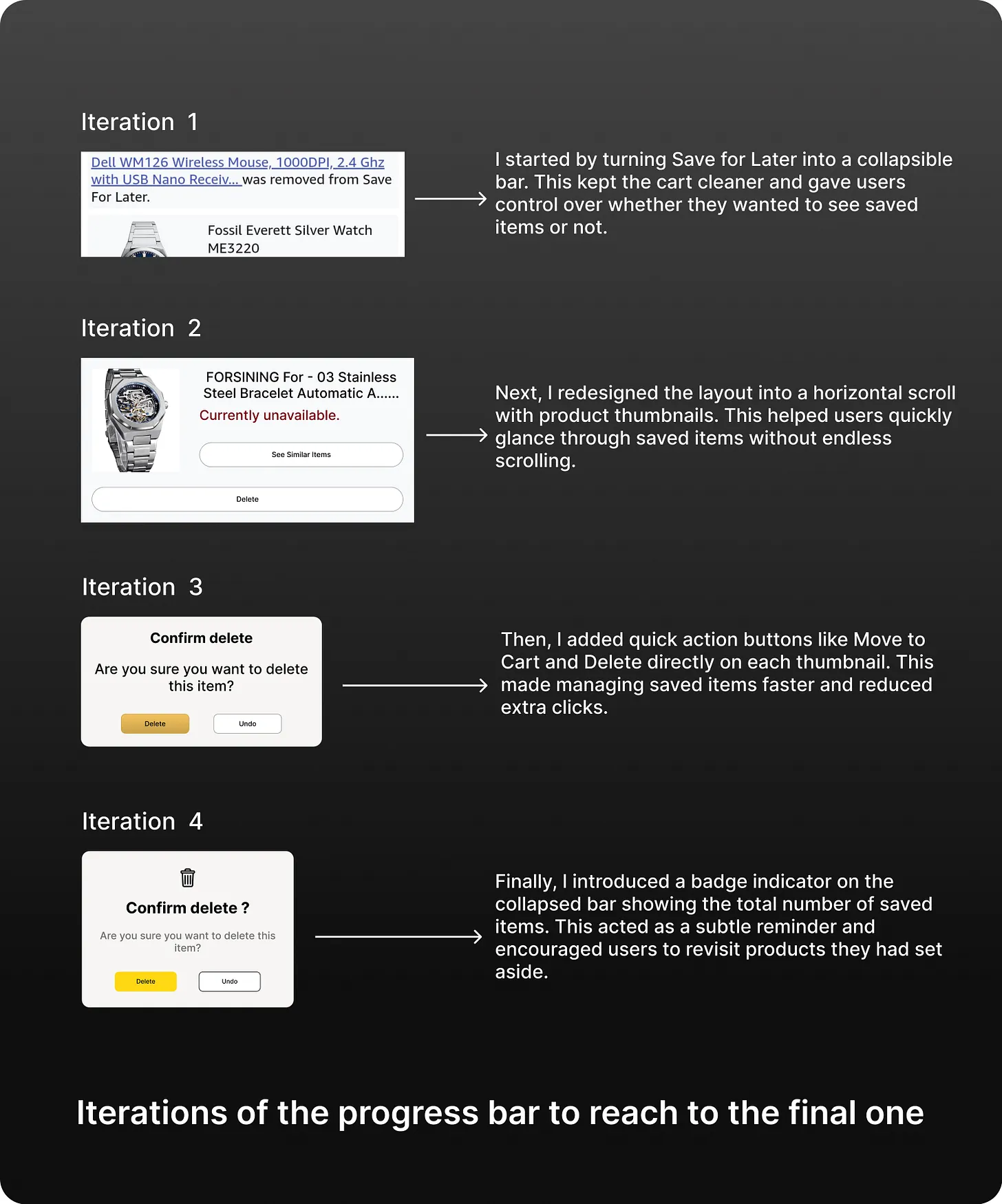
Evolution of the Confirmation Popup:
Now, let me take you though what i added with each iteration and why?
So, It’s time to unveil the final Confirmation Popup to you:
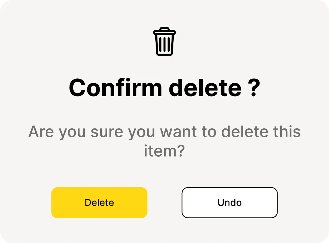
As I was researching different apps for competitive analysis, I noticed how many e-commerce platforms used clear microcopy, distinct button colors, and lightweight modals to avoid user confusion. I realized that such design patterns brought the right focus and reassured users about their actions.
I decided to use a dark overlay background (to highlight the popup without distraction) and clear, contrasting CTA buttons “Confirm” and “Cancel.” This ensures visibility while keeping the design aligned with Amazon’s minimal style.
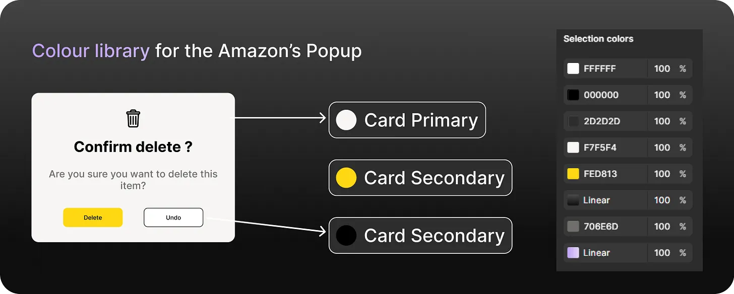
Let’s go through each element in the Confirmation Popup and look at the detailed reasoning behind everything.
The use of contrast and focus follows the principle that people pay more attention to interruptive, incomplete actions (similar to the Zeigarnik Effect)
This ensures the popup gets immediate attention before users proceed.
Good design requires good communication, especially from machine to person, indicating what actions are possible, what is happening, and what is about to happen. — The Design of Everyday Things, Don Norman
Here’s a glimpse at the full Component Architecture
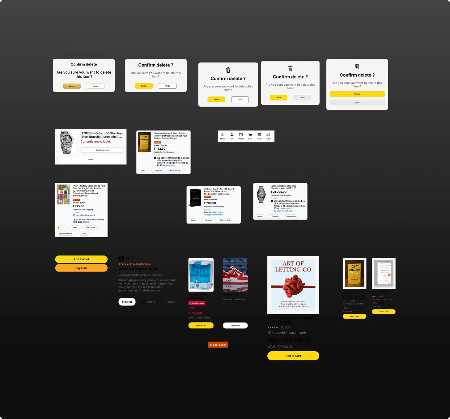
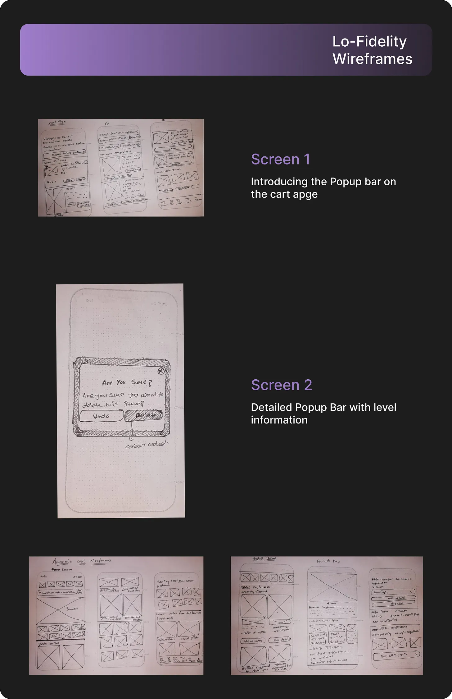
Based on the above wireframes, I began making the Lo-fidelity and High fidelity UI.
Here is how I re-iterated on the Save for Later feature after testing with users.
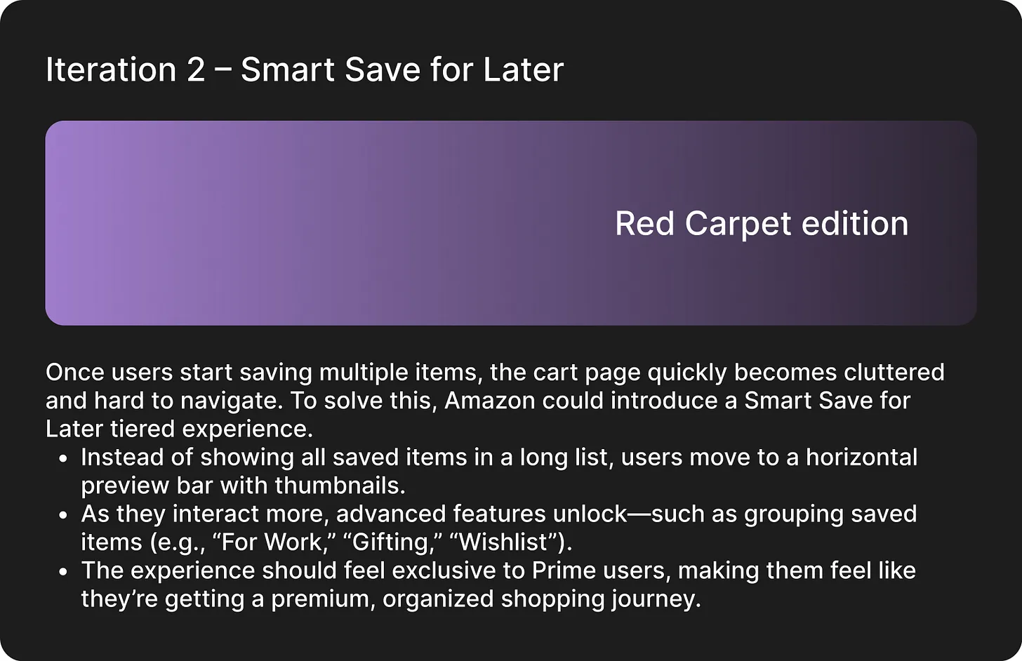
I redesigned it into a collapsible bar with product thumbnails, so users can quickly glance at their saved items without scrolling endlessly. I also added quick action buttons like Move to Cart and Delete, making it easier to manage saved products. Finally, a badge indicator was introduced to remind users how many items they have saved, encouraging them to revisit and purchase those items later.
This makes it easy for users to clearly distinguish between active cart items and saved-for-later items, reducing confusion, preventing accidental deletions, and improving trust in the checkout process.
After which I decided to take some user input and see if was headed the right path. Below are the screens with which I conducted the testing.
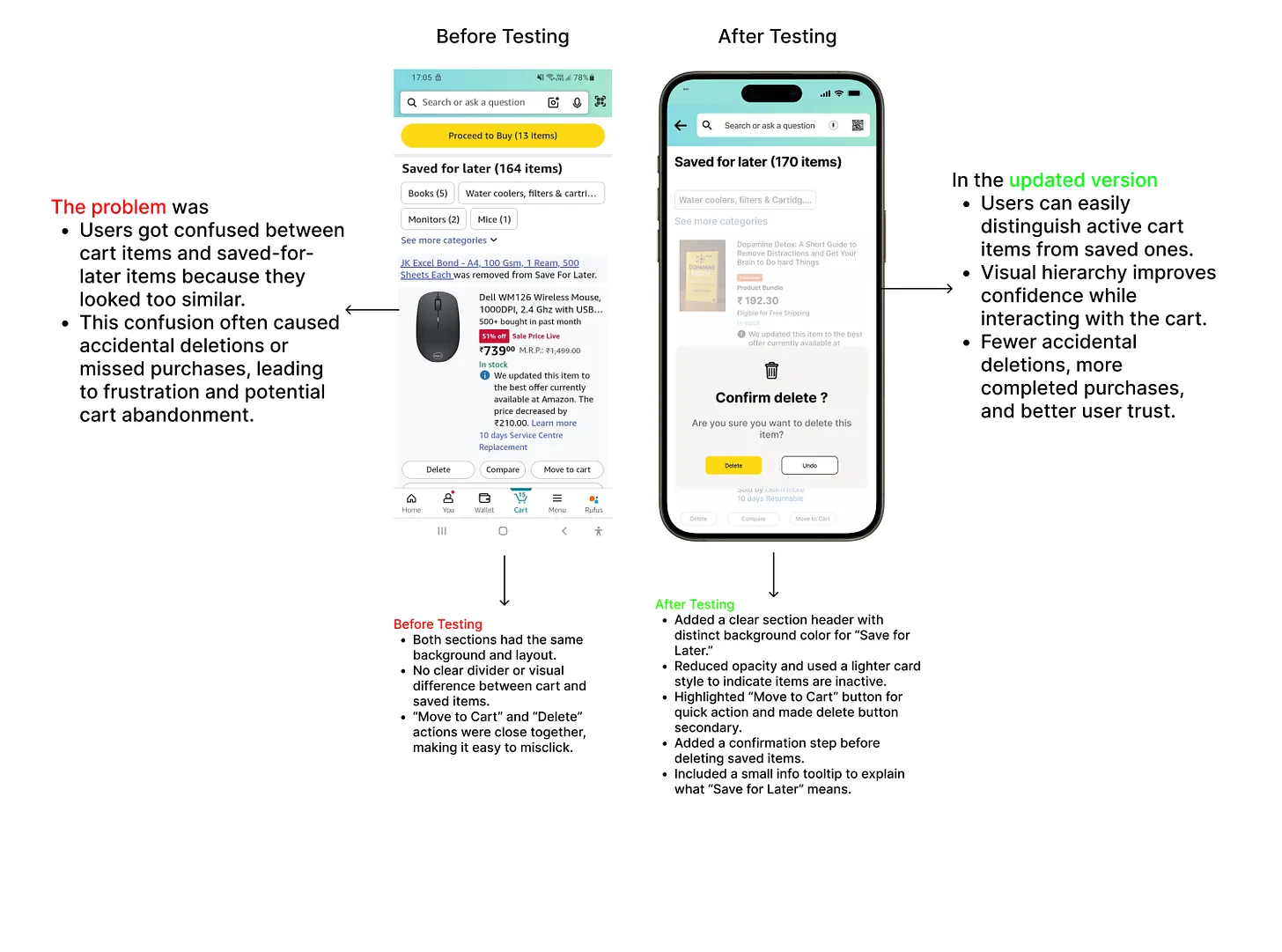
This makes it easy for users to clearly distinguish between active cart items and saved-for-later items, reducing confusion, preventing accidental deletions, and improving trust in the checkout process.
After which I decided to take some user input and see if was headed the right path. Below are the screens with which I conducted the testing..
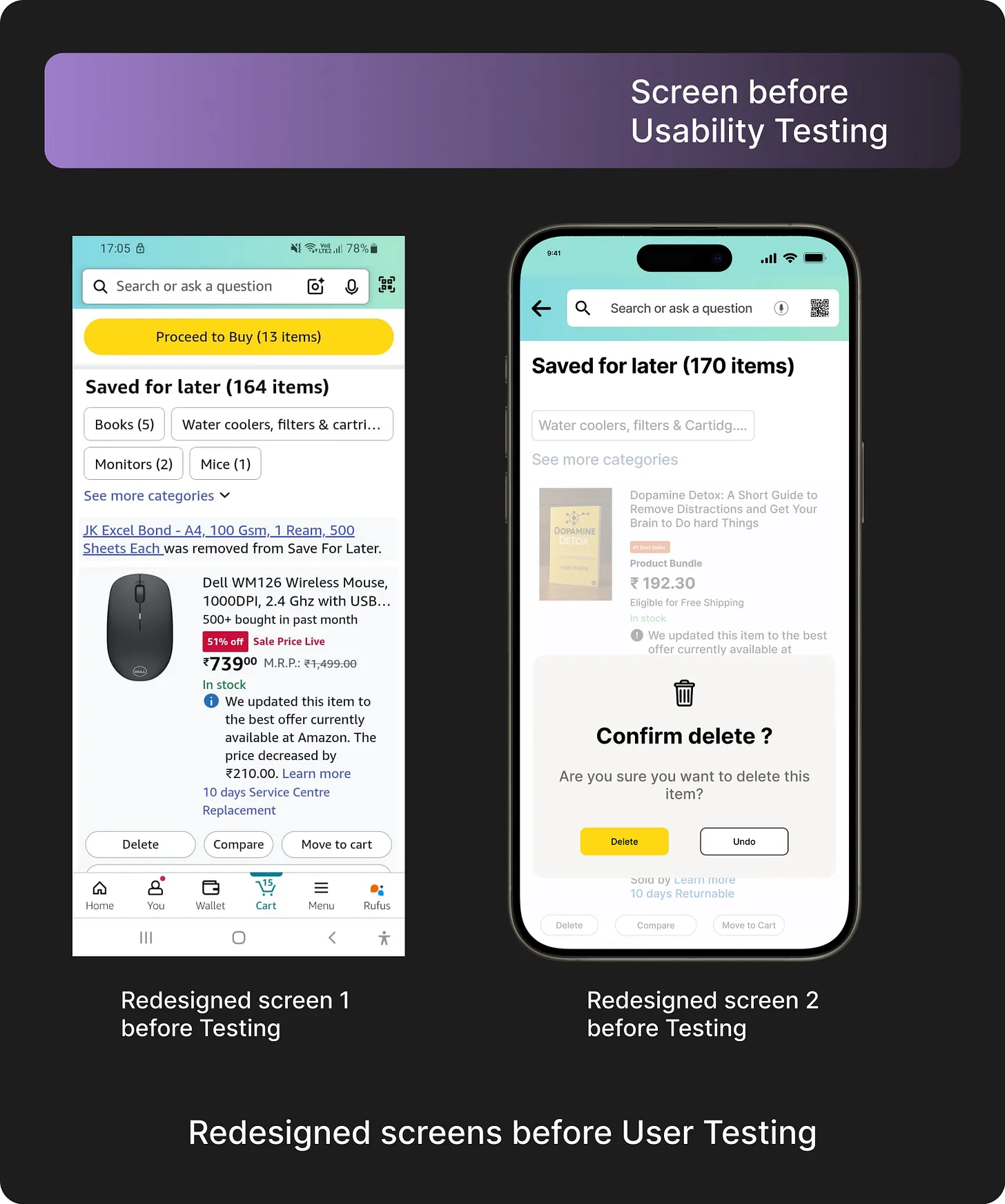
Let’s deep dive into my design process in improving Amazon’s Cart experience.
To start with, the process was non-linear, involving multiple iterations in both research and design decisions.
Let me walk you through the work and key design choices that shaped the improved solution. After identifying the UX problem, I made an initial hypothesis based on secondary research by exploring existing e-commerce cart systems and understanding common pain points around “Save for Later” interactions.
This was the initial macro flow I came up with:
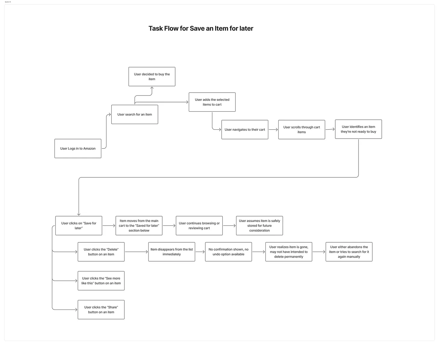
With my initial hypotheses in hand, I started talking to users to learn more about their experience with Amazon’s cart — especially how they interact with “Save for Later” and active cart items.
My main focus was understanding the pain points around distinguishing saved items from cart items, accidental deletions, and how these issues impacted their purchase decisions.
I made some initial preparations and created an interview questionnaire to gather insights from frequent Amazon shoppers and understand their behaviors and frustrations.
I had the opportunity to test my product with two wonderful people, Ayesha& Priya. I went in for comprehensive testing where I gave a basic context of what I was working for without giving too much detail. Next, I asked them to observe everything they could see on the screens as I noted all their observations.
A setup for onsite usability testing inside a testing lab.

Based on the above user testing, I reanalyzed my design and made significant changes and improvements in the screens which are as follows:
Earlier, I had decided to use Amazon’s existing color system for the Cart Page. But after user feedback, I decided to introduce clearer contrasts and slightly brighter hues in the Confirmation Popup so that the CTAs stood out more and minimized the risk of accidental actions.
I also decided to include product details (name + image) inside the popup, as I felt it would help users better understand exactly which item they were acting upon and reduce hesitation.
Additionally, I explored showing alternative actions (like “Move to Save for Later”) within the popup using a compact, scrollable layout, giving users more control without overwhelming the interface.
Through this project, I truly recognized the value of User Testing critical insights from user shaped massive improvements in the design and made the solution far more effective in preventing errors.
Here’s how competitor apps played a pivotal role in shaping the Amazon UX Design.
In a complex domain like e-commerce, it’s crucial to understand how competitors operate, not just from a business standpoint but also from a design and user experience perspective.
I began observing various direct competitors such as:
Flipkart
Walmart
eBay
Big Basket (for grocery-focused flowers)
Myntra (for fashion-specific flows)
And indirect competitors like:
Instagram (for product discovery and social shopping)
You tube (for product reviews and tutorials)

I began identifying patterns and understanding how competitor apps functioned for both new and existing users.
These observations served as valuable insights in building my Product.
Here’s how paper wireframing helped me transition from ambiguity to clarity in the whole journey.
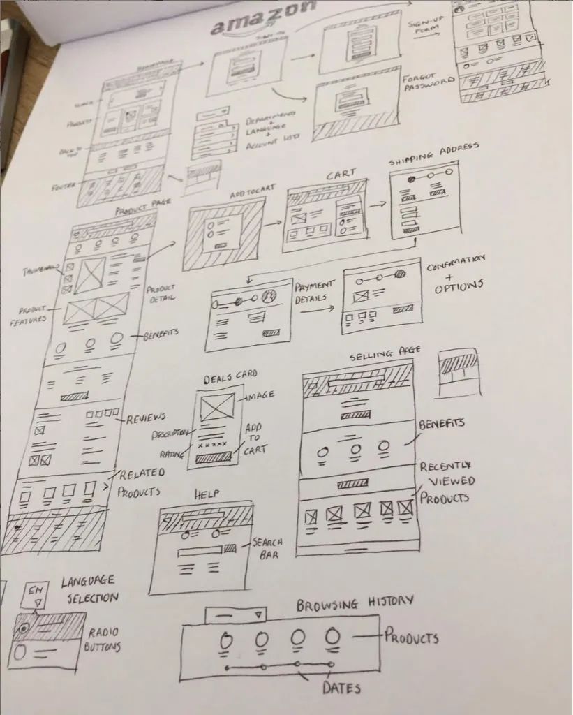
When I think of a screen or a flow, I jot down the essentials on paper and sketch the initial screens and iterate on it as needed.
After achieving clarity on paper, transitioning to digital screens becomes easier.
Despite encountering new things while making digital screens, this approach saved a lot of time and facilitates a smooth transition from ambiguity to clarity.
Here’s a sneak peek into the delightful chaos I created in the name of prototyping.

Last but not the least
Upon deciding colors; the first thing i did was to check the contrast ratios and accessibility for all combinations of background and foreground colors.
“Accessibility is the key to unlocking the potential of technology for everyone.” — Tim Berners-Lee, inventor of the World Wide Web
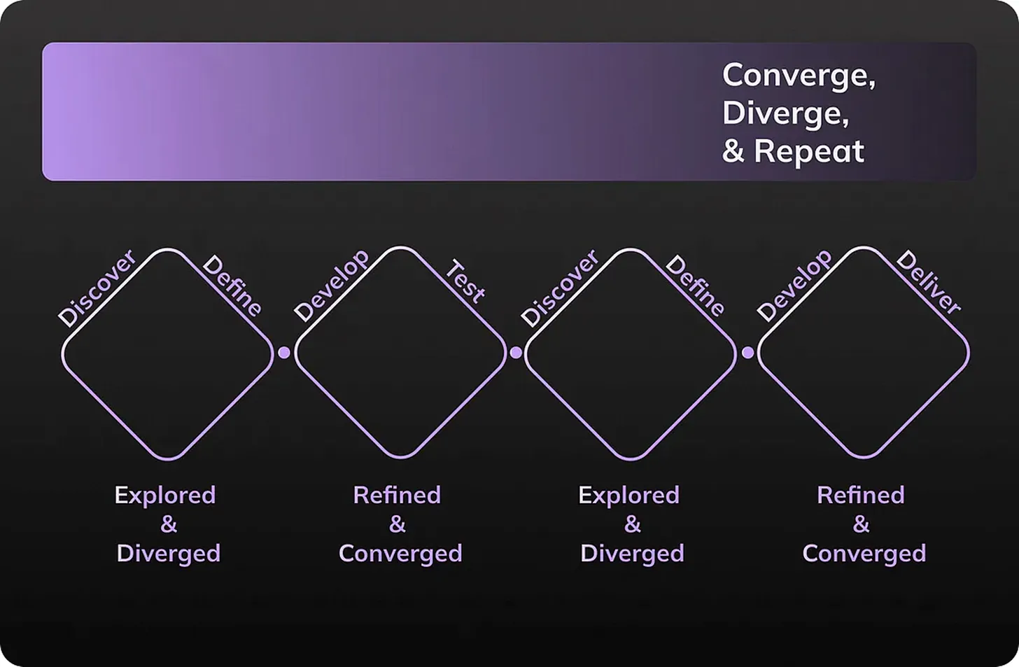
How I ended up following the “Double Double Diamond Approach”
Through collaboration and iteration, I ended up following the Double Double Diamond approach incorporating two diverging and converging phases in this project.
Future scope
What lies beyond the initial Confirmation Popup?
How can the popup design evolve to cover other high-risk actions in the cart (like bulk deletion or moving multiple items at once)?
How can the system indicate to users if their action has long-term effects — for example, losing applied discounts or offers when an item is removed?
Key Learnings — Amazon UX Problem: “Save for Later” Cart Feature
The Power of Good Planning:
Conducting thorough research and creating wireframes early on helped define the structure of the cart interface, ensuring high-fidelity designs aligned with user needs. Planning minimized redesigns and guided decision-making.
Research as a Compass:
User interviews, session recordings, and analytics revealed pain points like accidental deletions and visual confusion between saved and active cart items. Research became the foundation for user-centered solutions.
Wireframing for Clarity:
Low-fidelity wireframes allowed rapid iteration of layouts and interactions for both the cart and “Save for Later” sections, ensuring clarity in hierarchy and reducing cognitive load.
User Flow Optimization:
Redesigning the access to the “Save for Later” items emphasized balancing convenience (quick access to saved items) with exploration (encouraging continued shopping) to enhance engagement.
Balancing Simplicity and Engagement:
Streamlining the cart while visually differentiating “Save for Later” items demonstrated that a simple, clean interface can coexist with interactive elements that delight users.
Data-Driven Decision Making:
Metrics on clicks, accidental deletions, and user drop-offs informed design choices, highlighting the importance of validating hypotheses with quantitative data.
Working with Constraints
Designing within Amazon’s existing UI framework, screen space limitations, and tight deadlines honed skills in prioritization and efficiency.
What I learned and discovered about myself
Balancing Creativity and Practicality: I learned how to generate innovative design solutions for the cart and “Save for Later” sections while keeping in mind the practical constraints of Amazon’s platform. This balance helped me create solutions that were both imaginative and implementable.
User-Centric Mindset: Working on this project reinforced the importance of designing with the user in mind. Observing how users interacted with the cart and saved items guided every design decision.
Adaptability and Iteration: Feedback and user behavior insights taught me to remain flexible and refine my designs continuously. Iterating on initial ideas allowed me to improve usability and reduce friction in the cart experience.
Confidence in Design Decisions: By analyzing user data, conducting research, and trusting my instincts, I became more confident in making strategic design choices. This experience strengthened my ability to make informed decisions that positively impact the user experience.
This experience honed my ability to make strategic choices and trust my instincts
Completing this project under the invaluable guidance of UX Anudeep was truly enriching. Thank you for your dedication and guidance, which have contributed significantly to my personal and professional development.
Back to top
To get in touch:
✉ Email: shaikmohammedshabbir9490@gmail.com
Feel free to reach out and explore more of my work. I look forward to connecting with you.